We’re debuting a fresh new logo this year! We know many of you are accustomed to our original logo, but there are a few reasons why we think our new logo will win you over.
Beyond the Letter V
You’ll immediately notice the new Virtuas logo is shaped like a “V”, which of course stands for Virtuas. Look a little closer and you may notice something more.
Intersection of Infrastructure and Modern Workplace
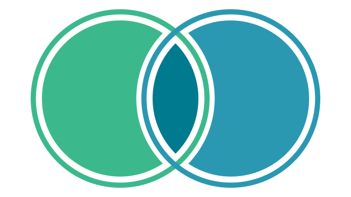
The logo is a wedge from a Venn diagram of two intersecting sets. The wedge symbolizes how Virtuas blends together multiple facets to deliver our world-class solutions.
While other IT companies focus on just infrastructure, we’ve always taken a more holistic approach. We bring together traditional IT services with Modern Workplace solutions in a way that’s practical for small and medium organizations. We believe that sound technology infrastructure provides a foundation for success, but it takes Modern Workplace solutions to get organizations to where they can use technology to thrive.
Since our approach is unique, we wanted to make sure it carried through to our new logo.
Our Values
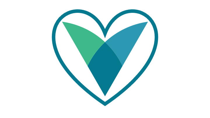
In addition to being a wedge from a Venn Diagram, our new logo also resembles the shape of a heart, which symbolizes our values. Virtuas cares, and we strive to work in a way that truly benefits our employees and our customers.
It continues to be our mission to Redefine IT to stand for Integrity and Transparency. We keep ethics at the forefront and profits in the background, seeking to make a positive impact in the world.
One More Thing…
Our new style also includes a diamond shield shape. Taken from the intersection area of our logo, it symbolizes where all of the magic happens.
It’s Already Live!
We are really excited about our new logo, which better represents our brand. We hope you also like this new look for Virtuas! Our digital presence and stationary have the updated logo but let us know if you see the old logo floating around somewhere. We thank you for your continued support.